
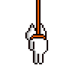
Shown above: The "divine" hands granting Chi-Chi her wings

Concept art more along to the idea of a storybook style. There apparently is little material or concept art readily available. This is the only work presented to me at the time of my presentation.
Crit:
-The lineart is near final, it's the black pen tool and it clearly looks more like a draft than final animation. Furthermore, the colour (flats) emphasize the 2-dimensionality look of the film. Whatever colour is dominated by all the black lines as the bg is also swamped with black lineart.
-Plot is undeveloped, it could be more and would probably succeed in showing the spiritual motivations behind the film. However, as it stands now, it looks and plays like a cliche cutesy animal flick.
-The constant pokemon-like "chee" noises could be annoying to many viewers. "Less is more."
-Religious themes are obvious and could turn off some viewers. This may or may not be a problem considering who is the intended audience. Could be fixed by implying the sleeve of the hand is not so much a robe but rather a sweater or something a general person would wear, avoiding religious icons.
-Work on a storybook style animation look. It'd help her film flesh out an original style and fit her desires beyond her film itself. There are many examples for this (TV's Caillou, etc), but one example that I can think of is the 3D and 2D style employed in the introduction to the Nintendo 64 game, "Yoshi's Story."
No comments:
Post a Comment